

Timeline
August - December 2020
Primary Function
UI/UX Design
Overview
In the Fall of 2020, I interned with Ansys's UX Team and worked remotely on a variety of visual, animation, and new feature interface projects for ANSYS's recently launched simulation engineering software, Discovery. I had the pleasure of collaborating with a fellow UX intern as well as other members from our UX and Product teams on my deliverables.
VIRTUAL DESKTOP INTERFACE LAUNCHER

Prior to the end of our release cycle, the product team asked us to design a desktop interface and a set of experiences allowing Ansys clients to remote launch the Discovery software hosted on ANSYS servers. We had two weeks to design and validate hi-fidelity interfaces that capture connection and loading experiences for developers to finish building before the end of the release.
Team

Client Lead, 2 Designers
My Role


Co-Designer, Delivery Manager

Tech
Figma (Design), WPF (Development)
Primary User Experiences
1
Launch, abort, and end new session connections
3
Configure and save server connection settings for quick launch
2
View and retrieve session configurations from a list of past sessions
4
Interact with visual content that promotes the Discovery application
First Iteration
Our first set of concepts were visually too complex and over-scoped per what the technology and development timeline afforded developers. In part, this occurred because requirements weren't clearly communicated or the constraints weren't made clear.

These design concepts helped us quickly identify appropriate information archtecture and layout options that would best be received by the product team. It also helped us understand that our client prioritized form over function for this particular iteration of the app launcher.
Second Iteration
Our second iteration was well received and met all of the expectations of the product team. However, upon a late review of the mockups from a few UX team members, they pointed out a few areas where we could have made the button, icon, and content display styling and interaction patterns align more better with Discovery.

These designs reflect an understanding that the main application functions should be apparent and without much distraction from visually graphic content. However, we underestimated the product team's appetite for a more visually complex interface background and iterated through a few concepts to meet their change request.
Our UX colleagues had also pointed out a few miscues regarding the styling and state changes for a few of our buttons and icons. We soon course corrected the small changes using examples from the product's design toolkit / test harness.
Final Iteration
The product team came back to us having descoped a few requirements and use cases, due to timing and resource deficiencies, with an additional ask of redesigning the banner for the desktop interface. We experimented with a few different models and styling options before landing on the one proposed below.
.png)
These designs use negative space, layering, and dark styling themes to communicate an immersive, visually stimulating, yet simple interface and set of controls.
Figma proved to be a great tool for informal, real-time collaborating on multiple background concepts. The other UX intern and I riffed off each others work and were easily able to reach consensus on the final design.
ICON REDESIGNS

Over the entirety of the internship, I worked on icon design requests and spearheaded my own exploration into improving the visual and conceptual clarity of the physics icons that appear in several places through the Discovery interface. My work exploring icon design on this product was particularly challenging and rewarding due to the following factors:
Contrast with varying anochromatic backgrounds
Aesthetic brand alignment and visual clarity
Size variations (16, 24, 32 pixels)
Complex physics concepts and phenomenon

In-context examples of where and with what frequency icons appear across different interface themes (Left), Icon color model for theme-dependent physics icons across different interface themes (right)
Fluid Structural Interaction Icon
I designed an icon that is meant to convey two physics elements, fluid and thermal, interacting with a single structure. I iterated through concepts exploring curvature, stroke width, and color to help identify and distinguish symbols in the icon. I also attempted to repurpose existing symbols to preserve visual consistency across physics icon sets.
SET 1

SET 2
With the guidance from a UX designer, we landed on the icon set #2. We redesigned the icon to improve the icon's visual clarity in smaller sizes, even though that conflicted with the typical design patterns, crisp and angular, found in other icons and UI components.
Physics Icon Sets Color and Concept Exploration
One of the primary concerns with the theme dependent physics icons was that it was difficult to differentiate icons across physics icon sets when there were several physics icons displayed in the UI. The fact that these icons displayed in 16 x 16 pixels made it even more difficult to identify and distinguish icons.
In response, I explored the use of color to identify and distinguish icons within and across physics icon sets. I focused first on the thermal set of physics icons exploring new conceptual symbols and introducing red into the theme-dependent color palette.

Using three colors in a single icon doesn't render well in smaller sizes and can be overwhelming if multiple physics icon are visible in the UI.
The new symbols used are a good attempt at improving conceptual clarity, but the style deviates too much from existing icons.
I then explored how the physics icon sets might render in their associative colors, i.e. purple, blue, and red, instead of the theme dependent colors (green, orange, blue). To my surprise and to the product leaders liking, the icons rendered rather well.

The black and white themes contrast fairly well with the new icons, but the medium theme has poor contrast with the purple icons.
Having identified contrast consideration and implementation constraints, I iterated through a few different variations of the purple, blue, and red accent colors to see which contrasted best across all themes. I then proposed a model for how the developers might incorporate these colors into their design toolkit / test harness to promote color palette socialization and ease of use during design iteration and development.


More Physics Icon Redesigns
Under the new color model, I proceeded to iterate through some more icon redesigns but with more constraints than I had in previous iterations. In my new redesigns, I experimented with making design changes that were less of a departure from existing icon sets but more visually and conceptually clear than existing icon designs.

Icons bound by a blue border are the existing icon and the concepts with a start were the ones our design director decided to move explore further.
Over the course of this design exercise, I found that a conservative piece-meal approach to making icon changes was better received by product owners and UX colleagues. However, I found that approach at times contrasting with the bold, share, and inventive design ethos that the UX team expoused.
Understanding that the product team planned to introduce new physics icon sets further along in the product roadmap, I recommended that the team experiment further with the proposed color model change before pushing any changes. I also advocated for the removal of the grey theme if customers do not use it as often the dark and light themes. In my opinion, a color model change to physics icon sets is best introduced with other color background design decisions and the advent of new physics in the application.
LOADING CURSOR ANIMATION

At the beginning of the internship, I and another UX intern were tasked to design a loading cursor animation that would be displayed during loading and wait time events in the Discovery application. Apart from prototyping state change animations for mobile UI controls, I had never designed visually complex motion graphics. I recognized my inexperience and welcomed the challenge of learning new design software and approaching a design prompt with motion, aesthetics, and time top-of-mind.
Scoping Design Iteratively
Account for varying durations
Convey progress, entertain, communicate brand
GIF only; no logic
32 x 32 pixel size
Contrast with multiple anochromatic backgrounds
Futuristic, sharp, seamless
Designing collaboratively, the intern and I iterated through a few concepts and did a two rounds of vetting with UX colleagues. We also defined guidelines and available attributes we should adhere to and experiment with in our first iteration of designs.

.png)
On the left, we documented all the different design attributes we could experiment with in our concept designs. On the right, the yellow starred concepts were our UX team's favorite and the blue starred concepts were identified as having favorable attributes to incorporate into the the primary concepts.
In our design jams, we were mindful of all the different ways the animation had to make sense in different contexts. For instance, we intended to design an animation that provides a "good experience" whether the loading event lasts 2 seconds or 3 minutes. We also wanted the state changes to be fluid and calming so to not overwhelm or miss the user. Lastly, we had to negotiate using exacting motions and visuals without losing contrast and visibility.
Proposed Concepts
After our UX team selected the two themes to pursue, the intern and I worked independently on each theme. I selected the geometrics concept while the other intern worked on the logo concept.

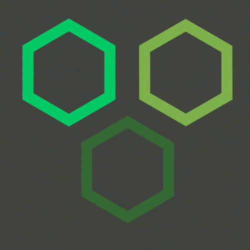
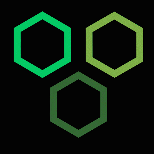
The inspiration behind my design was using concepts and symbols from the product and presenting them abstractly in the cursor design. The three hexagons represent the 3 products from which the Discovery Unified software is made. The figure animates, builds and deconstructs around "Y" shilouette similar to how engineers iteratively optimize the physical design of models using Discovery. Lastly the alternating flashing lights is a reference to how one would wait for stoplights.

This is the logo concept that the other intern worked on. It is themed around the Discovery logo transforming in various ways.
Finalized Concepts and Next Steps
I developed concepts 1A and 1B after several days of learning how to design and manipulate controls on After Effects. The 1B concept visualizes an improves transition between major shape state changes in 1A. Concept 2 is the logo themed concept that the other intern worked on.
1A

1B
2
Our design director decided to move forward the logo concept. While my concept was a worthwhile endeavor and brought to light some interesting effects and visuals, the logo animation was the most brand salient concept.
At this point, I retired from working on the loading cursor animation, but I did share my design file and thoughts with the other UX intern as the design director thought some of my animations concepts could be incorporated into the logo concept.
I learned how much software knowledge and design planning is involved in motion design. This experience has set me up to better approach and be more efficient on future motion design projects if I were tasked to do them.
Even though my final concept wasn't selected and my design turnaround was slow comparatively, I felt that my ability to identify constraints, manage the design process, and generate compelling motion concepts was just as valuable to the final deliverable. While I don't see myself becoming a dedicated motion designer, I look forward to working collaboratively with them on such projects; I developed a great appreciation and passion for approaching product design with a movie production lens.
REFLECTIONS
Apart from the projects I disclosed above, I also designed graphics and writing copy for the team's SharePoint hosted styleguide having developed content for topics such as Icon Design, Color Usage, Text in UI, Motion and Microinteraction Principles.
I also began, but did not finish, developing a set of new and revised user goals, task analyses, as well as interfaces and features for how users currently view, organize, and draw insights from changes performed to physics parameters and model designs within Discovery.
It was great to work on an established UX team and challenge myself developing several aesthetic, graphic design deliverables as opposed to the business and function focused design work that I am used to. Likewise, I enjoyed learning and incorporating Discovery's futuristic, serious, and game-like design aesthetic into my deliverables; definitely a departure from the soft and friendly design aesthetics I have encountered in the past.
My problem scoping, awareness for tasteful and brand-appropriate design, as well as my communication and management skills were well received by my Ansys UX teammates. I hope to continue to exercise these skills as well as grow my mastery over design software in future product and ux design endeavors.
.png)
PERFITS
MOBILE APP
Thanks for viewing!
Feel free to explore other projects.
